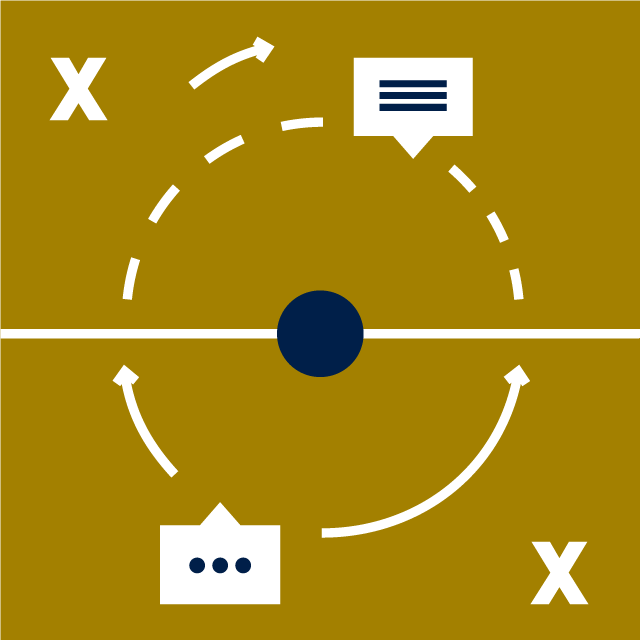
Our proprietary illustrations are designed to complement our headline messaging. They should be simple, modern and clever.
Illustrations
Our illustrations should only use a maximum of three colours and be in keeping with our colour combinations (see ‘Colour’). It is not permitted to use tints in the creation of new illustrations.
The style is clean, playful and simple. Ideally, the polo should be incorporated as a small detail of the scene or object or creatively crafted into a clever new detail that references the circular silhouette.
If you require the creation of a new illustration, please fill out the Illustration Request Form with as much detail as possible. Please bear in mind that illustrations should have more than a single application, therefore we may endeavour to adjust design briefs to avoid the creation of overly niche or single-use products.
Brand illustrations can be found in the firm-wide image library.


Using illustrations
Illustrations are supplied in three aspect ratios, square (1:1), landscape (2:1), and portrait (1:2). The choice of aspect ratio should be determined by the available space.
Illustration quick guide
In general, illustrations should occupy a majority of their given container, with some clear space left around the outside.
Illustrations should not be cropped or otherwise covered, except in the case of full bleed versions.
Some landscape and portrait versions of our illustrations are designed as ‘full bleed’. Full bleed illustrations should reach from one edge of their container to the other with no margin (or in the case of print, from one bleed guide to another). These illustrations contain information all the way along their longest axis and end abruptly at their bounds, therefore, there should be no clear space on either side of the long axes.
Illustrations can be scaled, but scaling should be consistent and never applied to a single axis. This means that illustrations shouldn’t ever be squashed, stretched, or otherwise distorted.
Illustrations are detailed designs and these details should always be legible, therefore illustrations should never be scaled smaller than 120px on their shortest axis (i.e. the smallest version of a portait (1:2) illustration would be 120px wide and 240px tall). If you need to incorporate an image at a scale smaller than 120px, please use an icon instead.
Creating illustrations
Illustrations should always be produced on artboards of the following dimensions:
| Aspect ratio | Artboard size |
|---|---|
| Square (1:1) | 320px x 320px |
| Landscape (2:1) | 640px x 320px |
| Portrait (1:2) | 320px x 640px |
In the first instance, illustrations should be created in RGB format.
Design files will be meaningfully named and should note their colour space (RGB/CMYK) and included colours. The following is an example of best practice:
Illustration-name – RGB – apple turquoise fossil.ai
Design files should always be in Adobe Illustrator format and contain all three aspect ratios of an illustration in a single colour scheme on individual artboards. If additional full bleed versions are created, these should also be stored in the same file.
For illustrations that aren’t full bleed, a 32px margin should be included on each edge.
Stroke thickness should always be 4px.
Objects of the same colour may only be overlapped if the foreground object is separated by a 4px transparent stroke (i.e. an outline for the foreground object would be cut out of the object(s) behind to reveal the background).
Objects (any solid shape) should be at least 8px thick on their shortest axis, this differentiates effectively between strokes and shapes.
Illustrations should always feature transparent backgrounds.
Background colours will be kept in mind when designing illustrations, any part of an illustration that makes use of the background colour should be ‘cut’ into the design so that it is transparent, revealing a background below rather than incorporating this colour into the design.
Once an illustration is finalised, a new version should be created in CMYK format. These should then be recoloured so that a version is available for each colour palette.
Exporting illustrations
Illustrations should be exported in the following formats and sizes:
| Aspect ratio | Export format @ dimensions |
|---|---|
| Square (1:1) | PNG @ XXpx x XXpx |
| PNG @ XXpx x XXpx | |
| SVG @ N/A | |
| Landscape (2:1) | PNG @ XXpx x XXpx |
| PNG @ XXpx x XXpx | |
| SVG @ N/A | |
| Portrait (1:2) | PNG @ XXpx x XXpx |
| PNG @ XXpx x XXpx | |
| SVG @ N/A |
Exported illustrations will be meaningfully named (in alignment with their design file) and should note their colour space (RGB/CMYK), included colours, aspect ratio, dimensions in pixels (when exporting as a bitmap), and in the case of full bleed designs, “full-bleed”, separated by dashes. The following are examples of best practice:
Illustration-name – RGB – apple turquoise fossil – square – 500×500.png
Icons
Our icons can be used in print, online and in digital forms such as Microsoft Word and PowerPoint templates as a device to highlight content or punctuate information.
Our icons feature a bold simplicity and are designed to be impactful and clean. This gives them a friendly appearance which helps to guide and inform our clients. The minimum size for our icons is 24px in web and 4.5mm in print. The maximum size for our icons is 120px in web and 22.5mm in print.
Icon rendered at its maximum size, 120px.
Icon rendered at its minimum size, 24px.
Plain icons


Icons on colour


Icon colours can be edited by users, please ensure the use of our brand colour palette only, being mindful of the colour combinations in use, and do not use any tints. Icons should only ever feature a single colour.
Icons can be found in the firm-wide image library.
Creating icons
Illustrations should always be produced on artboards of the following dimensions:
| Aspect ratio | Artboard size |
|---|---|
| Square (1:1) | 32px x 32px |
Icons should always be designed as black objects/strokes on a transparent background.
Design files will be meaningfully named and indicate their nature as an icon. The following is an example of best practice:
Icon-name – icon.ai
Design files should always be in Adobe Illustrator format.
A 4px margin should be included on each edge.
Stroke thickness should always be 2px.
Objects may only be overlapped if the foreground object is separated by a 2px transparent stroke (i.e. an outline for the foreground object would be cut out of the object(s) behind to reveal the background).
Objects (any solid shape) should be at least 4px thick on their shortest axis, this differentiates effectively between strokes and shapes.
Icons should always feature transparent backgrounds.
Exporting icons
Icons should be exported in the following formats and sizes:
| Description | Export format @ dimensions |
|---|---|
| Small | PNG @ 32px x 32px |
| Large | PNG @ 120px x 120px |
| Vector | SVG @ N/A |
Icons should be exported with meaningful names (in alignment with their design file) and should indicate their nature as an icon as well as their dimensions in pixels (when exporting as a bitmap). The following are examples of best practice:
Icon-name – icon – 32×32.png
Icon-name – icon.svg