Our bold, confident logo reflects the firm’s ability to deliver focused and clear advice. The polo that adjoins the two words in this logo represents the firm’s ability to connect with its clients and get straight to the point.
Main logo
Logo versions
Care must be given to ensure that the logo has adequate contrast against light or dark backgrounds. The letters within the logo must always be black or white.
The polo is a flexible component that can change colour depending on the background. The colour of the polo should always match the primary accent colour of a design (see ‘Colour’).
The following examples show how the logo should be used in a variety of contexts.
Logo sizing
The minimum size for all printed material is 30mm wide and 150 pixels (at 72dpi) for digital on screen use. The logo should never be used at less than this size as this would lead to a compromise in legibility. For large formats such as banners, billboards and signage, the logo should be proportionally balanced to the size of the document.
Guidance is set out below for a range of standard document sizes, as a rule of thumb, the logo should be approximately XX% of the longest edge of any given format.
| Document size | Logo width |
|---|---|
| A3 (297mm x 420mm) | XXmm |
| A4 (210mm x 297mm) | 45mm |
| A5 (148.5mm x 210mm) | 35mm |
| Pocket brochure (78mm x 78mm) | 30mm |
| 1080p (HD) video | XXpx |
| 2160p (4k) video | XXpx |
For specific guidance on logo usage in documents outside of the standard sizes included in these guidelines, please speak to a member of the brand team.
Clear space
It is important to keep the logo clear of any other graphic elements. To ensure this, an exclusion zone or ‘clear space’ rule has been established using the ‘T’ which is exactly 10% of the width of the logo. The size of the ‘T’ is proportionate to the scale of the logo. This exclusion zone indicates the distance that any other graphic message can be positioned in relation to the logo and the space needed when placing a logo on the corner of a page.
This means that at an A4 scale of 45mm wide, no graphic elements should come within 4.5mm of the logo.
Logo positioning
The logo can be positioned on any of the four corners of a page but its primary position is the top right corner. The benefit of positioning the logo top right is that it accommodates for any content, overprinting, text and graphics that will fill the remaining space.
Logo avatar
The Travers Smith logo cannot fit into a small app icon or social media avatar. For this reason, we must use the truncated TS avatar across all social media platforms, website favicons and app icons.
The truncated logo cannot be used in any other instances and may not be used as a replacement for the logo.


The Polo
The polo reflects our firm’s ability to deliver focused and meaningful advice.
The polo should always be sourced from our brand assets to maintain consistency. It is a standalone graphic and must never be re-created in applications such as Word or Powerpoint.
If an individual polo is required for a document, please speak to a member of the Brand team.
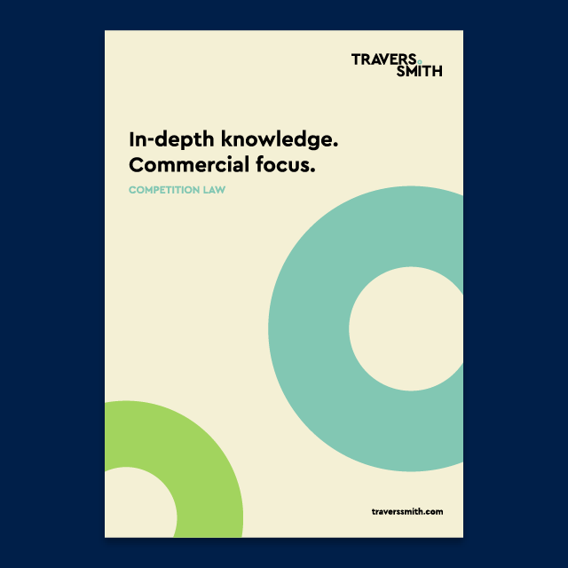
Where is it used?


The polo when used as a standalone graphic
How is it used?
The polo is a significant part of our brand and should serve as a striking graphic feature within branded materials.
The polo can be used as a standalone graphic element on materials.
Where there are two or more polos, it is acceptable for individual polos to not be fully visible in their entirety, and can be positioned near the borders of the artwork.

The polo as a pattern
Where is it used?
The pattern is primarily used on applications such as modules, divider pages, product merchandise and across the website.
Ready made patterns are available, please speak to a member of the Brand team.
Usage considerations


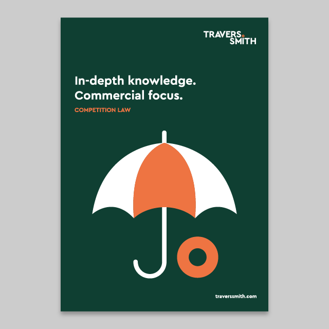
The Polo within Illustrations
The polo is a highly flexible device within illustrations – if the guidelines are adhered to, there are no limitations.
Correct use of the polo in illustrations


Incorrect use of the polo in illustrations